
EFE client portal
Project Overview
The Edelman Financial Engines Client Portal redesign aimed to modernize the self-service experience for individuals actively building their net worth—especially the 'everyday millionaire.' After the success of the Momentum Financial Wellness Checkup, it became clear that this tech-savvy audience expected more control over their financial tools. The legacy portal lacked basic account management features, creating friction and dependence on financial planners. The new design introduced a seamless, autonomous experience aligned with evolving client expectations and evolving business priorities driven by new leadership direction. .
As the Lead Product Designer, I drove the end-to-end UX strategy—including user research, design ideation, wireframing, and implementation of key self-service capabilities—while navigating the complexities of designing within both the legacy Edelman brand and the newly evolving brand identity. This new approach required careful consideration of visual consistency, tone, and usability across different systems.
SOlution
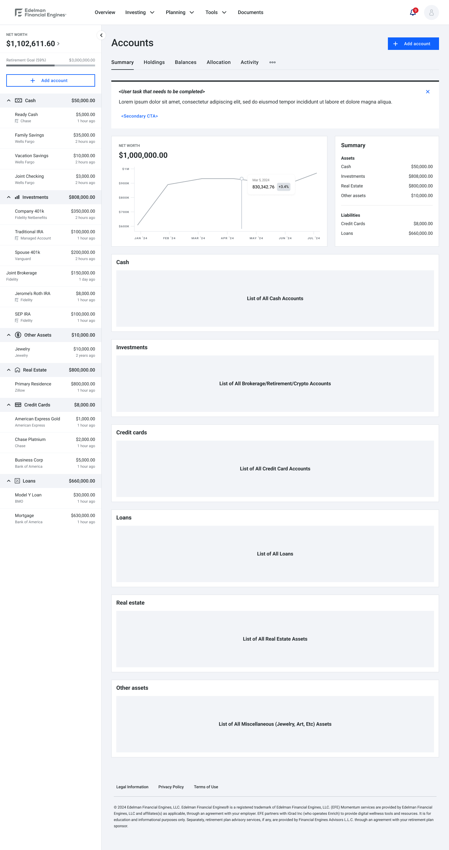
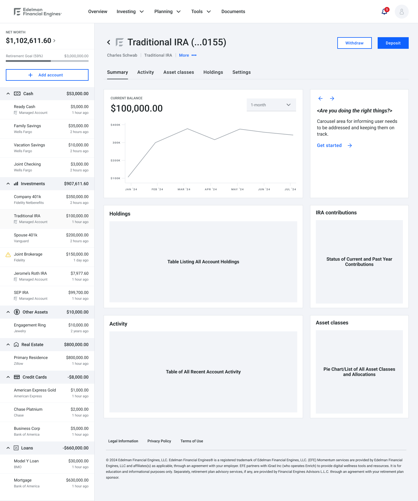
We reimagined the portal around self-service and transparency. Users could now:
Add, view, and manage accounts without planner mediation
Access real-time financial data and planning tools
Personalize their dashboards for smarter decision-making
View and interact with their plan
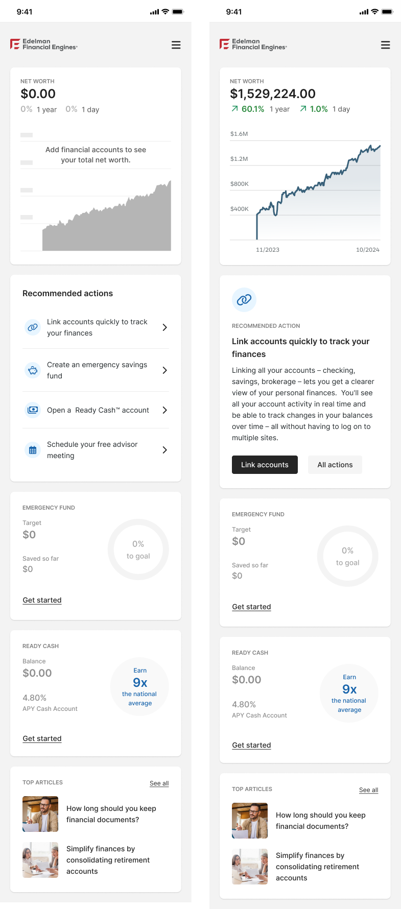
The interface was minimalist, data-forward, and optimized for mobile use, ensuring high engagement and accessibility. As part of Edelman's rebrand, the team and I also delivered a new design system—updating components and creating new design tokens in both the legacy and new brand styles—to maintain continuity while transitioning users to the modernized look and feel.
My Role: User Research, Journey Mapping, IA, Interaction Design, UI Design, Prototyping
Tools: Figma, Miro, Google Analytics
Discovery & research
user research
As Lead UX Designer, I partnered with the Consumer Insights team to conduct surveys, in-depth interviews, and behavioral analysis to uncover key needs of our primary users—tech-savvy, mid- to high-net-worth individuals seeking greater financial independence. Research revealed that:
Users wanted autonomy in managing their financial lives
Transparency and real-time access were essential to building trust
Seamless integration with Edelman Financial services enhanced overall experience continuity
Competitive Analysis
I conducted a comprehensive competitive audit of top-performing financial platforms to identify emerging trends and user experience best practices. Across the board, platforms were shifting toward:
Automation of routine financial tasks
Mobile-first, highly intuitive interfaces
Personalized dashboards enhanced by AI-driven insights
These insights were especially critical in guiding the new design system, ensuring our product was both current and flexible enough to evolve with the new Edelman brand.
KEY INSIGHTS
Heavy reliance on planners created unnecessary friction
Clients demanded speed, autonomy, and mobile-first access
Personalization and real-time transparency significantly increased user trust and satisfaction
concepts
We started with low-fidelity sketches to test the layout of core self-service flows. These were followed by:
Mid-fidelity prototypes to validate navigation and account management features
High-fidelity clickable prototypes used in usability testing and stakeholder demos
Accessibility Considerations
WCAG-compliant color contrast
User interface components and navigation must be operable
Simplified language for readability
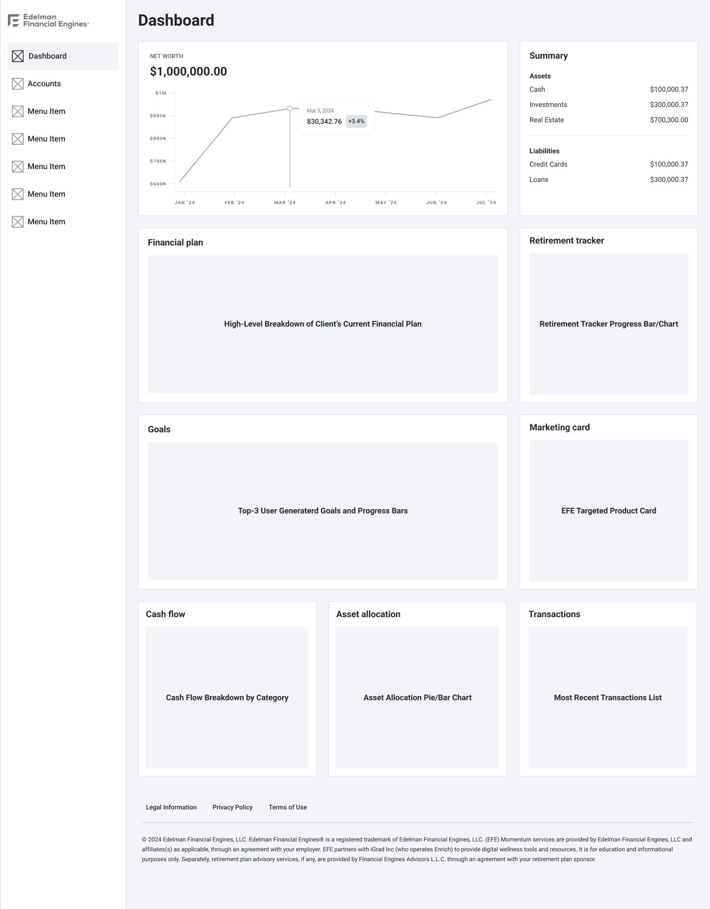
Mid-Fidelity wireframe Exploration
Below is a sample size showcasing distinct exploratory user flows for navigation and page layouts/hierarchy, and corresponding mid-fidelity wireframes to support this project’s early design phase.

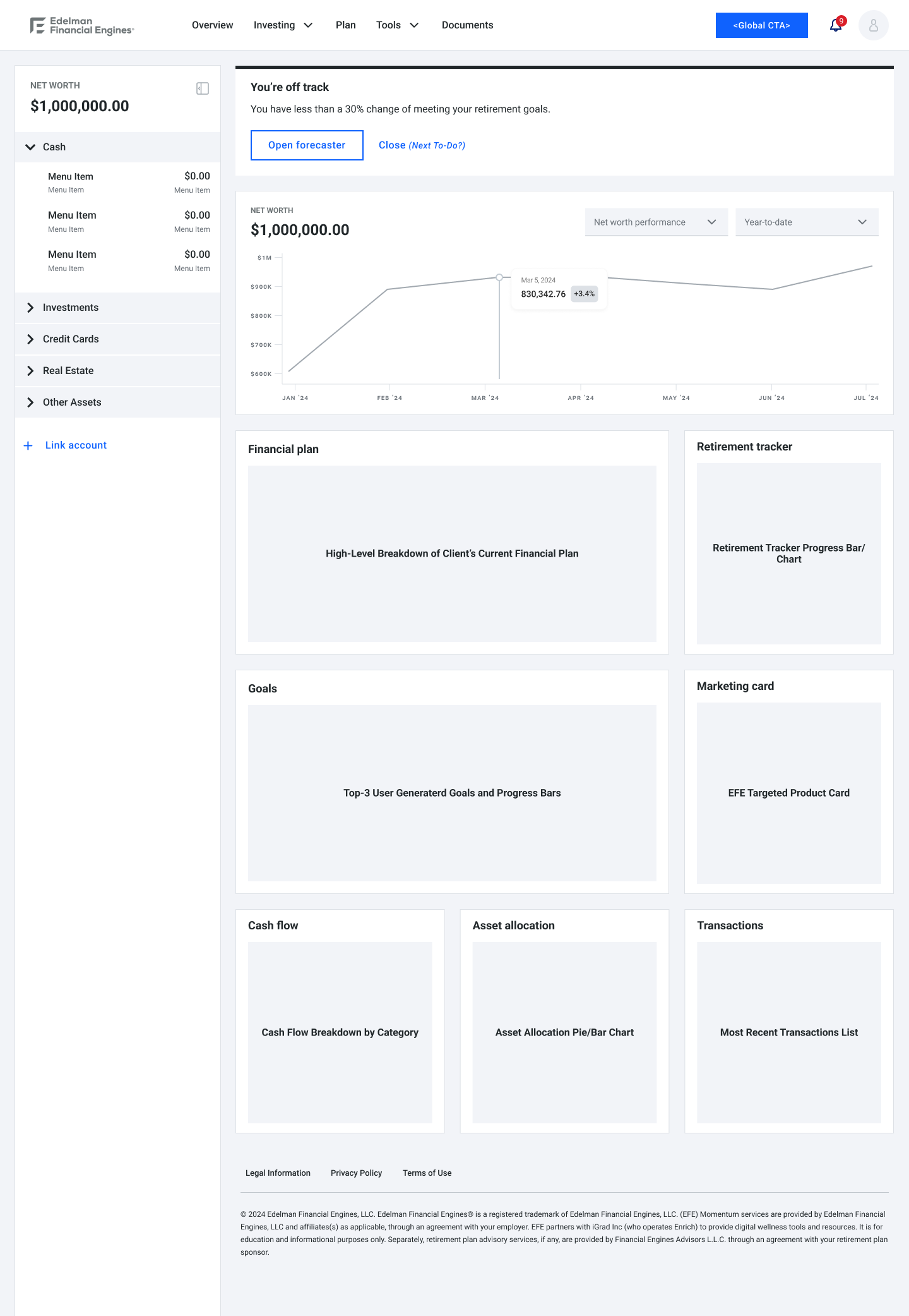
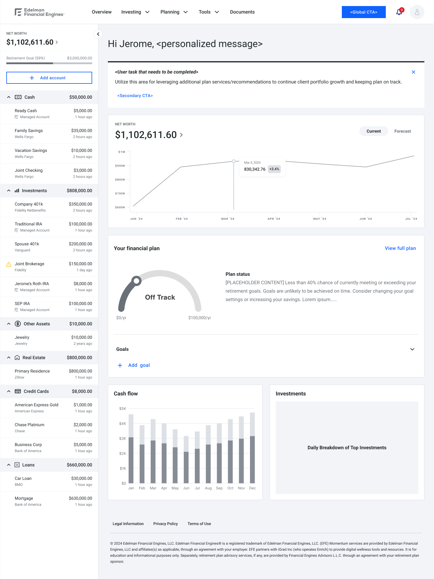
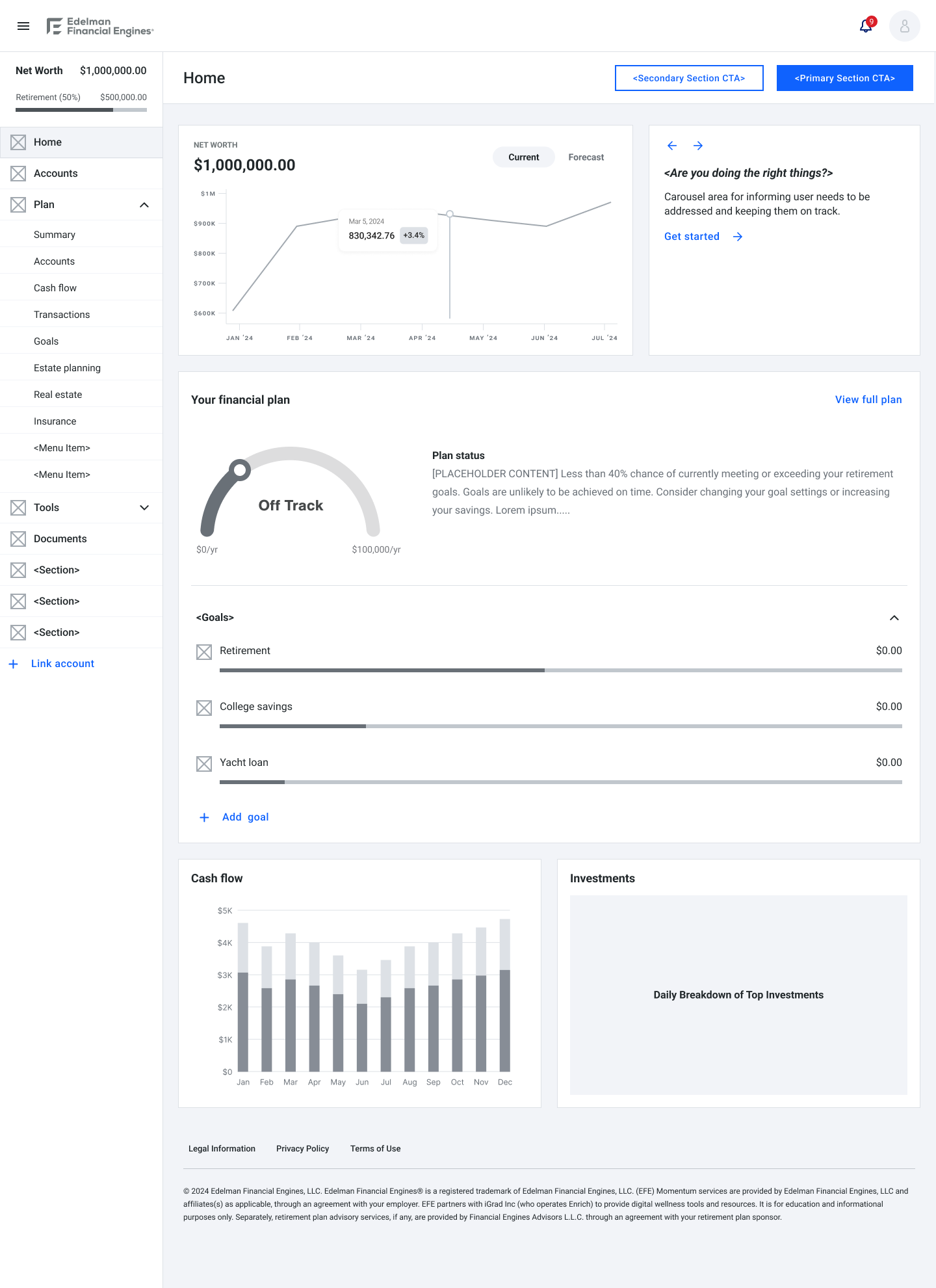

High-Fidelity UI Concepts
The UI mockups below incorporate our new design system explorations prior to the final direction being decided.


UI mockups
Design Strategy
Minimalism & Clarity: A clean interface that allowed data to shine
Personalization: Dashboards tailored to user goals and behaviors
Mobile Optimization: Fully responsive design for access on the go
Accessibility: High-contrast visuals, simplified content for financial literacy inclusivity, and WCAG-compliant elements
Accessibility Considerations
WCAG-compliant color contrast
High-contrast visuals
Simplified language for readability


impact & reflections
Challenges Faced
Driving adoption among advisor-dependent users
Merging modern UX with legacy systems
Meeting compliance while enabling automation
Ensuring brand consistency across legacy and rebranded designs
Lessons Learned
Digital-first, research-driven design is a competitive edge
Reducing friction boosts engagement and retention
Consistent, modern branding builds user trust
Next Steps
Facilitating the migration of existing clients to our redesigned product
Enhance mobile functionality
Strengthen compliance to support scalable automation